 Other objects
brought to life from the etchings include Brobdingnagian urns festooned with
griffins and other fantastic creatures, elaborate candelabra and lost
antiquities. Fragments of designs are
scattered on tables in the style of an 18th century wunderkammern,
testimony to Piranesi’s art but also the technicians’ skill and science
bringing these pieces to life from the black and white prints.
Other objects
brought to life from the etchings include Brobdingnagian urns festooned with
griffins and other fantastic creatures, elaborate candelabra and lost
antiquities. Fragments of designs are
scattered on tables in the style of an 18th century wunderkammern,
testimony to Piranesi’s art but also the technicians’ skill and science
bringing these pieces to life from the black and white prints.Thursday, April 11, 2013
Virtually Piranesian
 Other objects
brought to life from the etchings include Brobdingnagian urns festooned with
griffins and other fantastic creatures, elaborate candelabra and lost
antiquities. Fragments of designs are
scattered on tables in the style of an 18th century wunderkammern,
testimony to Piranesi’s art but also the technicians’ skill and science
bringing these pieces to life from the black and white prints.
Other objects
brought to life from the etchings include Brobdingnagian urns festooned with
griffins and other fantastic creatures, elaborate candelabra and lost
antiquities. Fragments of designs are
scattered on tables in the style of an 18th century wunderkammern,
testimony to Piranesi’s art but also the technicians’ skill and science
bringing these pieces to life from the black and white prints.Tuesday, July 26, 2011
Le Dingbat Nouveau


In “Los Angeles: The Architecture of Four Ecologies” Reyner Banham popularized “dingbat” to describe the horrendously bland and ubiquitous developer driven apartment buildings that cover the flats of LA. Far away from the high design inhabiting the hills, canyons and beaches preferred by architects of the Case Study program, these clunky rent generating machines, consisting of 4, or 8, or 12 studio, 1-bedroom and two bedroom units were often the first arrival point for many recently minted Angelenos. Their desperate designers tried to compensate for the relentless mediocrity with a swanky name (The Versailles, The Lido, Beverly Arms), and, in extreme cases, a fancy metal mansard roof, an oversized swag lamp in the entry court, a couple of cartouches and…hold for it… glitter stucco. Like the romanticized bungalow courtyards of Nathanael West’s “Miss Lonely Hearts” they are now part of Hollywood's background scenery. They are comfortably ensconced as an easy shorthand for a certain despairing and striving social strata of Los Angeles – in the films these sad sack dumps are occupied by grifters or screenwriters.
San Diego has its own home grown version of the dingbat, thanks to wise guy developer Ray L. Huffman. North Park is blighted by these 6-pack, 8-pack and 12-pack apartment buildings. Even today realtors tout Huffman’s expertise in cramming as many units as possible into the ugliest box possible. There were few attempts to upscale or sweeten the relentless efficiency of these ghetto creators. San Diego’s dingbats lack even a veneer of style. In their defense, they are the mainstay of affordable housing in San Diego. They are just ugly and cheap.
Well, those were different times, right? Well, yes and no. We have now what I call the Dingbat Nouveau – new apartment and condo buildings no doubt lauded by fans of San Diego’s City of Villages plan. Denser and bigger these new buildings are thankfully more aware of the politesse required to shoehorn denser and bigger into the fine-grained neighborhoods of North Park, Hillcrest and Mission Hills.
Well, at least some of the time.
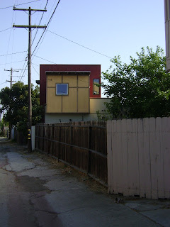
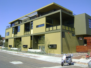
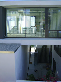
Here are some pics of some winners… and some losers. Let me know what you think. Are there new dingbats in your neighborhood?
Saturday, July 9, 2011
Esther McCoy Appreciation

The MAK Center in West Hollywood has some great events this summer - to celebrate his centennial, a July 23 tour of John Lautner houses and an appreciation of Esther McCoy, the architectural critic and historian who Reyner Banham famously called "the mother of us all." (He was talking about architectural historians, so I imagine "us" was a pretty exclusive party.) McCoy's role championing the remarkable activities of a few architects in a nascent Los Angeles architecture scene cannot be overestimated. Far from the usual suspects of high culture in New York or Europe her words, and the images of Julius Schulman and Marvin Rand captured the world's imagination.
Wednesday, July 6, 2011
'90s Funky Po Mo in Normal Heights


Bit of Venice style funk down the street from the Carmelite Monastery on Hawley. I'll do some research and find out more. Very Bay Area vibe. I like the picnic set with the Mission Valley view.
Saturday, July 2, 2011
The Charmer: Its Beauty and the Moonlight Overthrew Me

Clean and white against the cacophonous funk of Midtown, Jonathan Segal’s latest venture, the Charmer, could be a lost piece of Stuttgart’s famous Weissenhofsiedlung of 1927. The Bauhaus inspired architects of the Weimar Republic were exploring industrial and scientifically based models of living to replace traditions challenged by technology and rapid urban growth. Here, San Diego’s most visible architect/developer continues to explore the intricacies of traditional row homes and, in these economically anorexic times, maintain a positive spreadsheet. Corbu and Mies may have asked “architecture or revolution?” but Segal might ask “architecture or recession?”
Crisp volumes etched with elegantly proportioned black window frames step down a hillside site towards busy, one-way India Street. Here in Midtown India loses its Little Italy charm and functions more as a freeway access road. This nowhere land non-appeal has invited the appearance of a couple of outliers of hipdom – the Starlight, the Regal Beagle and retro-dive bar Aero among others. They blend in well with long time neighborhood stalwarts, El Indio and Shakespeare & Co. Charming in their own way, the bungalows and ‘50s apartments, car repair and other gritty services provides Segal’s project a messy counterpoint to the self contained “calme, luxe et volupte” qualities of this neo-modernist exercise.
From the street, the Charmer provides few clues to the individual unit layouts, aiming for a larger compositional unity with those large open windows, open walkways, balconies and expanses of white stucco, while the enigmatic entries within the court coyly declaim their physical separation. Here the ghost of Segal’s previous etudes on the row house model are apparent - and these post-modern and neo-traditional elements rub shoulders well with Segal’s new International Style moves.
The elongated proportions of the entries, flanked as they are by skinny cypresses, betray a certain soignee Hollywood Regency elan, but the atavistic simplicity of the ka’bah reminiscent black asphalt shingle covered cubes immediately sobers up any playfulness. Where a ‘80s architect may have joked it up with a fake wall or a twee reference to Palladio, Mr. Segal plays it straight. This is serious good work – jokey one-liners are not Mr. Segal’s style.
And jokes are luxuries in this economy, but several years ago Segal made a very cheeky one by framing, on the walls of the Museum of Contemporary Art in La Jolla, not renderings or professional photographs of his projects, but financial pro forma for several of his design/build projects. Pulling back the curtain on the “art of the deal” he was characterized as a walking, talking, designing Howard Roark manqué – and was criticized by some aesthetic mandarins for being financially involved with projects where his bottom line could trump his aesthetic aspirations.
Whether through luck or a strategic decision to play the rental market rather than the condo market, Mr. Segal thrives where other architects, and their aesthetic aspirations, struggle. Segal continues to champion the DIY aesthetic and economics of the design/build model. Like the Farm-to-Table movement, Segal’s design/build strategy is based on locally available resources and - more critically – local demand. Given the continuing flat state of the economy, Mr. Segal’s ventures and their financial and aesthetic success are remarkable, and the success of the Charmer is a sign of hope for a more intimate integration of the building site, construction techniques, design, designer and the public that uses the building.
Consisting of two more or less U shaped buildings surrounding a parking/entry courtyard, the project is remarkable for the apparent openness of the units – window treatments will be in demand- and the embrace of one California tradition often praised but rarely revived – the bungalow court. Esther McCoy’s “The Second Generation” must have been a constant reference point for the design team. This neo-modernist touchstone is certainly “The American Vignola” for a certain generation of California architects, and whether generally referencing Corbusier’s Villa Savoye or possibly Raphael Soriano’s Colby Apartments of 1952, the focus on the courtyard pays deep homage to McCoy’s sensibilities regarding the possibilities of civilized and gracious accommodations for communal living.
The courtyard is carefully arranged composition of landscape and building that – seriously – must be the best outdoor space built in San Diego since Louis Kahn’s courtyard at the Salk. Shaded with Chinese Elms, the courtyard has a casual but formal air – European, almost French, but not doctrinaire and certainly unexpected. An allee of trees frames a tapis vert, but the vista leads to a bit of borrowed landscape from the car repair shop next door. The object of desire is to the right of the classical axis where – folly like, truly the machine in the garden- a more luxurious apartment unit takes on the light hearted seriousness of Gabriel’s Pavilion at Versailles, though in glass and stucco and bereft of putti or allegorical groupings. Happy tenants will celebrate summer not with a suburban barbeque but with a hipster fete galante.
The Charmer celebrates this place between the units – where before - at least on Mr. Segal's stern pro forma, only each unit’s financial stats would have been honored. I think Esther would be happy here. And that is saying something.


